![[C# Helper]](../banner260x75.png)
|
|
 |
![[Beginning Database Design Solutions, Second Edition]](db2_79x100.png)
Title: The ribbon interface: sacrificing usability for discoverability
![[The ribbon interface: sacrificing usability for discoverability]](ribbon_interface.png)
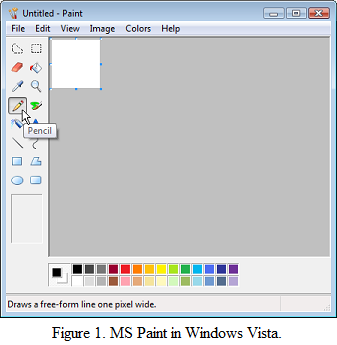
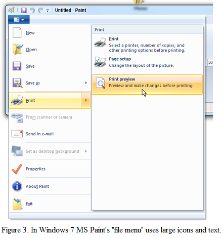
Unlike my usual examples, this post is a discussion of an important design technique: providing information for beginners without sacrificing efficiency for more experienced users. Next time I'll post a follow-up and then get back to examples after that. In a now deleted post, John Mueller discussed the user interface changes Microsoft made to the Windows Calculator program between Windows 95 and Windows 7. It's not clear why Microsoft felt the need to rearrange such a minor tool. Perhaps it was so they could say Windows 7 contains 101 new and improved features. Whatever the case, John argues quite persuasively that the changes are not for the better. In this post I want to talk about similar changes that Microsoft made to MS Paint. Figure 1 shows MS Paint in Windows Vista. Figure 2 shows MS Paint in Windows 7.

One difference between the pictures that is immediately obvious is that the Windows 7 version takes up a lot more space. That's because it replaces the tidy little toolbox and color palette in the Windows Vista version with multiple tabs on a ribbon. If you like, you can think of the ribbon as a toolbar on steroids. I think of it as an endless morass of jumbled commands and options that makes it hard for me to find anything. Before the ribbon was invented, commands were categorized hierarchically in menus and cascading submenus. To find a command, you opened the appropriate menu, dug into the submenus, and picked your command. All commands were labeled with text so it was relatively easy to scan the menus and submenus to find what you wanted. A menu item could also have an associated icon on the left but those were mostly decoration. They could provide pictorial confirmation of the command that could help you verify that you had found the right command (like a little printer next to the print command). Or they could show the current value of a command (like the currently selected foreground color). But you still used the text to find the command and then the graphic to get confirmation or extra information. The ribbon interface contains a mixture of graphics and text that makes it hard to search effectively. To perform a hierarchical search, you would first need to figure out which tab to open. If you didn't know better, you might be able to guess that the zooming commands would be in the View tab. I'm not sure I would guess that the ruler, grid line and status bar commands would also be in that tab. Putting everything else in the Home tab makes the top level of the command hierarchy almost useless. It makes the program seem as if Microsoft tried to put everything in one tab and then put things that didn't fit in the View tab. Assuming you guessed the correct tab to search, you would then want to find the category on the tab that seems relevant for the command you want. If you look at Figure 2, you can see that the tabs are divided into sections. Unfortunately their names are on the bottom below some really eye-catching graphics so your eye is naturally drawn to the graphics first. At this point you're left to stare at a bunch of graphics with no apparent groupings. Instead of a series of sections, you have a whole bunch of separate tools. Most of them are reasonably self-explanatory but you still need to stare at them for a little while before their meanings sink in. The result is that the ribbon looks cool and has much nicer icons than menus used to support because they're bigger, but your brain needs to switch from text (tab name) to image (tools) and probably misses the tab section names completely. The switch from text to graphics is slow and finding the tool you want takes a while. (If you think switching between text and graphics is no big deal, take a look at the Stroop effect. It's not quite the same thing but has similar consequences. For a fun and interesting example, see this post at Verywell Mind.)

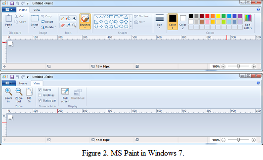
In contrast, look at MS Paint's "file menu" in Figure 3. (Although it doesn't actually say "file" anywhere.) This menu also holds large icons but the text is all aligned to the right of the icons so it's easy to scan down the items ignoring their icons if you like. Take a moment to try it out. Try to find the Properties command. Is it easier to look at the text or to try to decipher the icons? This menu lets you do both, but the ribbon only gives you the icons. The ribbon works well if you just want to browse around and see what tools are available (or if you just want to bask in the warm glow of the pretty icons), but it's hard to use if you know what you want to do. I suspect this is another productivity enhancement for beginners like Clippy and Microsoft Bob were. (Remember them?) For a specific example, consider an operation that I need to perform all the time: pasting an image with a transparent background onto another image. I often take a screen capture to put in a book. Screen captures don't show cursors, however, so I need to paste an image of a cursor over the main image. In the Windows Vista version of MS Paint, you open the Image menu (because I'm pasting an image) and toggle the Draw Opaque command so it's not checked. This is not completely intuitive but it's fairly easy to find with trial and error, and once you've done it it's easy to find again. To do the same thing in Windows 7, you open the ribbon if it isn't already there, go to the Home tab, open the Select dropdown, and check "Transparent Selection." When I first used this version of MS Paint, I wandered around to see what tools were available. I even found this command but since it was a selection command, it didn't occur to me that it was what I needed to use when pasting. I even submitted a trouble ticket to Microsoft asking them why they had removed such a useful feature and the response was that removing the tool was by design and would not be fixed. Even Microsoft didn't know how to find the tool! (Much later I learned how to find the tool from a web post. Lately I get a lot more useful information from the web than from Microsoft's help, but that's another story.) So where am I going with all this? I don't really mean to just bash MS Paint. It's a pretty useful program that I use at least a dozen times a week, and the new version has a lot of new tools. I don't use the new tools much (mostly I use MS Paint to capture and annotate images) but I can see how being able to draw stars and arrows, to use new brushes, and to display rulers and grids could be useful to some people. The real problem here is in the ribbon and fact that it sacrifices ease of use by more experienced users in favor of pretty icons and ease of browsing by beginners. I'm all in favor of making life easy for beginners but not at the expense of more experienced users. After all, a beginner doesn't stay a beginner forever. A beginner who keeps using the program will become experienced and eventually perhaps expert. (Although I think tools like the ribbon also slow down users in becoming advanced because they make you spend more effort on finding tools than on using them effectively.) If you save the beginner five minutes per week but then cost experienced users even one minute per week, you haven't really helped. Over several years' time, a user may spend a month or two as a beginner a few years as an experienced user. For a tool like MS Paint, Word, Excel, or other tools that many users look at every day for many years ... you do the math. Yes over time you can get better at finding tools in the ribbon, but I've been using tools with the ribbon for several years now and I still can't find anything in many of them. If anything I've learned to do without some tools that I used to be able to use easily. So how can you handle this sort of problem and give extra help to beginners without getting in the way of more experienced users? MS Paint, Word, and other ribbonized programs could allow you to choose either the new ribbon interface or the "classic" menu interface. Beginners could use the ribbon as long as they want and those who know what they want could use menus to make finding specific tools easier. A program could even provide both menus and a ribbon. This would mimic the menus-and-toolbars approach that many programs have used for decades and that seems to work quite well. The only difference would be that the ribbon uses bigger images and takes up more room, but that wouldn't be so bad. Unfortunately providing both ribbons and menus would require extra work so it's unlikely to happen. I also suspect Microsoft has a vested interest in gently coercing people into using the ribbon interface so they can promote it as the next best thing since Clippy. The ribbon has become even more common in later versions of Windows so it's probably here to stay. Note that Visual Studio still uses old-fashioned menus, an implicit acknowledgement that Visual Studio is too complicated to use the ribbon interface. (Thank goodness. That would be a nightmare!) For Microsoft's reasoning behind the ribbon, see Ribbons. Their basic argument is that the ribbon improves discoverability. I think this just highlights the fact that they're sacrificing usability by most users to benefit beginners.
|
![[Beginning Software Engineering, Second Edition]](book_sw_eng2_79x100.png)
![[Essential Algorithms, Second Edition]](book_algs2e_79x100.png)
![[The Modern C# Challenge]](book_csharp_challenge_80x100.jpg)
![[WPF 3d, Three-Dimensional Graphics with WPF and C#]](book_wpf3d_80x100.png)
![[The C# Helper Top 100]](book_top100_80x100.png)
![[Interview Puzzles Dissected]](book_interview_puzzles_80x100.png)
![[C# 24-Hour Trainer]](book_csharp24hr_2e_79x100.jpg)
![[C# 5.0 Programmer's Reference]](book_csharp_prog_ref_80x100.png)
![[MCSD Certification Toolkit (Exam 70-483): Programming in C#]](book_c_cert_80x100.jpg)

