![[C# Helper]](../banner260x75.png)
|
|
 |
![[Beginning Database Design Solutions, Second Edition]](db2_79x100.png)
![[Beginning Software Engineering, Second Edition]](book_sw_eng2_79x100.png)
![[Essential Algorithms, Second Edition]](book_algs2e_79x100.png)
![[The Modern C# Challenge]](book_csharp_challenge_80x100.jpg)
![[WPF 3d, Three-Dimensional Graphics with WPF and C#]](book_wpf3d_80x100.png)
![[The C# Helper Top 100]](book_top100_80x100.png)
![[Interview Puzzles Dissected]](book_interview_puzzles_80x100.png)
![[C# 24-Hour Trainer]](book_csharp24hr_2e_79x100.jpg)
![[C# 5.0 Programmer's Reference]](book_csharp_prog_ref_80x100.png)
![[MCSD Certification Toolkit (Exam 70-483): Programming in C#]](book_c_cert_80x100.jpg)

Title: Use the TableLayoutPanel control in C#
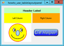
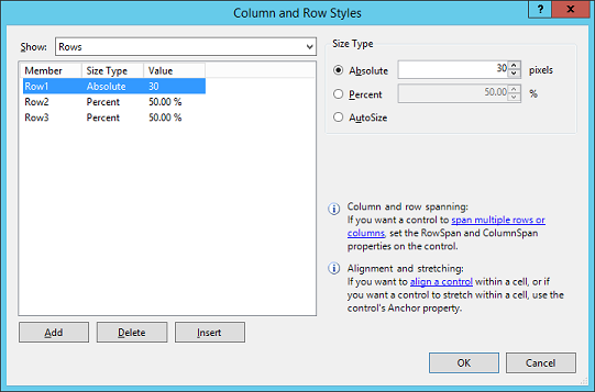
Much ado is made of WPF's Grid control, and rightly so because it's a pretty powerful control. However, many developers forget that Windows Forms has a TableLayoutPanel control that provides many of the same features. Place the control on a form. If you select the control, its Smart Tag lets you add, remove, and edit its rows and columns. If you click the Smart Tag's "Edit Rows and Columns" command, a dialog appears that lets you add and remove rows and columns, and set row and column sizes. You can set a row's/column's height/width to an absolute value in pixels, to a percentage, or to AutoSize to make it resize to fit its contents. (Percentage sizes aren't really percentages. Instead they're relative values. For example, if you have two columns with percentages set to 50% and 25%, then they're resized so one is always twice as big as the other.) If you resize the control, its rows and columns resize automatically as appropriate. For example, suppose you want to divide a form into two equally sized halves. To do that, you can use a TableLayoutPanel with Dock = Fill and with two columns having widths set to 50%. Now when you or the user resize the form, the columns automatically resize to divide up the form's area. After you build the TableLayoutPanel, you can add controls to it. You can then set a control's RowSpan and ColumnSpan properties to make the control span more than one row or column. By default, a control is aligned to the upper left corner of its panel cell. Use the control's Anchor properties to align it in a different way. For example, the Anchor value None centers the control in its cell. The value Top, Bottom, Left, Right makes the control stretch to fill its cell. (Alternatively set its Dock property to Fill.) Use a control's Margin property to add some room around the control so controls in adjacent cells don't touch. The example program uses a TableLayoutPanel control with two columns and three rows. The first row has a fixed height of 30 pixels. The other two rows have heights of 33.33% and 66.66%, so the second row is always twice as tall as the first. The columns have widths of 50% so they equally divide the form horizontally. The top left cell contains a Label with Dock = Fill and TextAlign = MiddleCenter. It also has ColumnSpan = 2 so it fills the entire first row. The smiley PictureBox on the lower left has SizeMode = Zoom so it resizes its picture to display it at the largest size possible without squashing or stretching it. The smiley has a white background so, if the PictureBox were to display only the picture, there would be non-white areas in the cell where the form's background would show through. A cell can hold only a single control, so to solve this problem that cell actually contains a Panel (with BackColor = White and Dock = Fill) and that control contains the PictureBox (also with Dock = Fill). Finally, the lower right cell contains a PictureBox (with Anchor = Top, Bottom, Left, Right and SizeMode = Zoom) that displays a C# Helper banner. Take a few minutes to experiment with the TableLayoutPanel control. Then when you need it later, you may remember that it exists.
Download the example to experiment with it and to see additional details. |