![[C# Helper]](../banner260x75.png)
|
|
 |
![[Beginning Database Design Solutions, Second Edition]](db2_79x100.png)
![[Beginning Software Engineering, Second Edition]](book_sw_eng2_79x100.png)
![[Essential Algorithms, Second Edition]](book_algs2e_79x100.png)
![[The Modern C# Challenge]](book_csharp_challenge_80x100.jpg)
![[WPF 3d, Three-Dimensional Graphics with WPF and C#]](book_wpf3d_80x100.png)
![[The C# Helper Top 100]](book_top100_80x100.png)
![[Interview Puzzles Dissected]](book_interview_puzzles_80x100.png)
![[C# 24-Hour Trainer]](book_csharp24hr_2e_79x100.jpg)
![[C# 5.0 Programmer's Reference]](book_csharp_prog_ref_80x100.png)
![[MCSD Certification Toolkit (Exam 70-483): Programming in C#]](book_c_cert_80x100.jpg)

Title: Make a shaded ellipse control in C#
Note: Before you can use the ShadedEllipse control in the example program, you must build the solution. After you download the example, build it before you try to view the form. This example walks through building a control that draws a smoothly shaded ellipse containing text.
Create the ControlStart by creating a normal Windows Forms Application. How the next step works depends on whether you have a Community Edition of Visual Studio installed. If you have some version other than a Community Edition installed, use the Project menu's Add New Item command to add a new Custom Control to the project. Name it ShadedEllipse. Initially the control opens in a designer, which is silly because the designer cannot display the new control. Switch to code view. If you got this far, skip down to the section, Initialization. If you have a Community Edition installed, then the Add New Item dialog probably doesn't list the Custom Control template. Fortunately that template only adds a couple of lines of code. Use the Project menu's Add New Item command to add a new class. Modify the class so it looks like the following.
using System.Windows.Forms; using System.Drawing; using System.Drawing.Drawing2D; using System.ComponentModel; using System.Drawing.Text; namespace howto_shaded_ellipse { public class ShadedEllipse : Control { #region template code private System.ComponentModel.IContainer components = null; protected override void Dispose(bool disposing) { if (disposing && (components != null)) { components.Dispose(); } base.Dispose(disposing); } private void InitializeComponent() { components = new System.ComponentModel.Container(); } #endregion template code } } If you had used a non-Community Edition to create a Custom Class, this code would be in a separate code file and the class would be marked with the partial keyword. You probably don't really need all of this code, but it's in a standard Custom Control and there's no harm in adding it here. Collapse the template code region and never look at it again. InitializationNow you need to add whatever code the control uses to provide its particular features. In this example the control inherits most of its properties and methods from the Control class. For example, it inherits its ForeColor, BackColor, and Text properties. It also inherits basic geometry such as the ClientSize and ClientRectangle properties. This example uses four new pieces of code: property initialization, a TextAlign property, an overridden OnPaint method, and an overridden OnTextChanged method. The first piece of code initializes the control's properties when it is created. Add the following constructor to do this.
public ShadedEllipse() { InitializeComponent(); // Set initial properties. Font = new Font("Times New Roman", 12, FontStyle.Bold); BackColor = Color.Green; } This code simply sets the control's Font and BackColor properties so the control initially looks nice.
TextAlignThe second piece of code is the following TextAlign property, which determines how text is aligned within the control.
private ContentAlignment _TextAlign = ContentAlignment.MiddleCenter; /// <summary> /// Determines the position of the text within the control. /// </summary> [Description( "Determines the position of the text within the control.")] public ContentAlignment TextAlign { get { return _TextAlign; } set { _TextAlign = value; Refresh(); } } This code uses a private variable named _TextAlign to store the property's value. The XML comment starting with /// gives IntelliSense information that it can display about the property when a programmer is using the control in the code editor. The Description attribute determines the text displayed at the bottom of the Properties window when this property is selected at design time. Finally the property's code simply gets and sets the property's value in the private variable.OnTextChangedThe third piece of code is the OnTextChanged method. At design time, if the programmer changes the control's properties in the Properties window, the control receives a Paint event and redraws itself, at least for most properties. If the programmer changes the Text property, however, the control does not automatically repaint. To make it redraw itself to show the new text, the control uses the following overridden version of OnTextChanged.// Redraw. protected override void OnTextChanged(System.EventArgs e) { Refresh(); } This code simply calls Refresh to make the control redraw itself.
PaintThe next piece of new code is the following OnPaint method, which does all of the really interesting work to draw the control.
// Draw the control. protected override void OnPaint(PaintEventArgs e) { // Draw smoothly. e.Graphics.SmoothingMode = SmoothingMode.AntiAlias; e.Graphics.TextRenderingHint = TextRenderingHint.AntiAliasGridFit; // Make an elliptical clipping region. GraphicsPath path = new GraphicsPath(); path.AddEllipse(ClientRectangle); Region clipping_region = new Region(path); Region = clipping_region; // Draw the background. using (Brush br = new LinearGradientBrush( new Point(0, 0), new Point(ClientSize.Width, ClientSize.Height), Color.White, BackColor)) { e.Graphics.FillEllipse(br, ClientRectangle); using (Pen pen = new Pen(BackColor, 4)) { e.Graphics.DrawEllipse(pen, ClientRectangle); } } // Draw the text. using (StringFormat string_format = new StringFormat()) { SetStringFormatFromContentAlignment( TextAlign, string_format); using (Brush br = new SolidBrush(ForeColor)) { e.Graphics.DrawString(Text, Font, br, ClientRectangle, string_format); } } } This code starts by setting some Graphics parameters to make the control draw smoothly. It then makes an elliptical clipping region so the control won't draw outside of its elliptical bounds. Next the code makes a LinearGradientBrush that shades from white in the upper left corner to the control's BackColor in the lower right corner. It then fills the ellipse and outlines it with a Pen of thickness 4. Half of the pen is clipped by the clipping region so the result is a border that's about 2 pixels wide. The code then calls the SetStringFormatFromContentAlignment method described shortly to set a StringFormat object's alignment properties. The code creates an appropriate brush and draws the text.SetStringFormatFromContentAlignmentThe following code shows the SetStringFormatFromContentAlignment method.// Set the StringFormat's alignment properties // appropriately for this ContentAlignment value. private void SetStringFormatFromContentAlignment( ContentAlignment text_align, StringFormat string_format) { // Set the horizontal alignment. switch (TextAlign) { case ContentAlignment.TopCenter: case ContentAlignment.TopLeft: case ContentAlignment.TopRight: string_format.LineAlignment = StringAlignment.Near; break; case ContentAlignment.BottomCenter: case ContentAlignment.BottomLeft: case ContentAlignment.BottomRight: string_format.LineAlignment = StringAlignment.Far; break; default: string_format.LineAlignment = StringAlignment.Center; break; } // Set the vertical alignment. switch (TextAlign) { case ContentAlignment.BottomLeft: case ContentAlignment.TopLeft: case ContentAlignment.MiddleLeft: string_format.Alignment = StringAlignment.Near; break; case ContentAlignment.BottomRight: case ContentAlignment.TopRight: case ContentAlignment.MiddleRight: string_format.Alignment = StringAlignment.Far; break; default: string_format.Alignment = StringAlignment.Center; break; } } This method simply uses two switch statements to set the StringFormat object's Alignment and LineAlignment properties so the object aligns text properly.
Toolbox Bitmap
There's one final piece to the new control: its ToolboxBitmap. To set the bitmap, create a 16×16 pixel bitmap file. Set the pixel in the lower left corner to the color that you want displayed as transparent in the toolbox. Next add the bitmap to the project and set its Build Action property to Embedded Resource. Now add a ToolboxBitmap attribute to the control's class as shown in the following code.
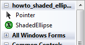
[ToolboxBitmap(typeof(ShadedEllipse), "ShadedEllipseTool.bmp")] public partial class ShadedEllipse : Control { ... } The attribute's first parameter gives a type that is in the assembly containing the bitmap. The second parameter is the name of the bitmap file. Use the Debug menu's Build command to build the solution and you're almost ready to go. I've had a lot of trouble getting the Toolbox to display the control's bitmap. When you build the control, it tends to display the default bitmap, which looks like a gear, instead of the one you want. To fix that, right-click in the Toolbox section containing the control, pick Choose Items, and uncheck the box next to the control to remove it. Next right-click the Toolbox section again and pick Choose Items. This time click the Browse button and select the control's compiled assembly. In this example it's howto_shaded_ellipse.exe and it will probably be in the project's bin\Debug or bin\Release directory. Now that the control is built, you should be able to add instances of it to the Windows Forms application. Change its BackColor, ForeColor, Text, and TextAlign properties to see what happens. Download the example to experiment with it and to see additional details. |
![[Make a shaded ellipse control in C#]](howto_shaded_ellipse.png)