Title: Understand font aliasing issues in C#

Aliasing is a process that graphics routines use to provide smoother results. Font aliasing is that process applied to fonts.
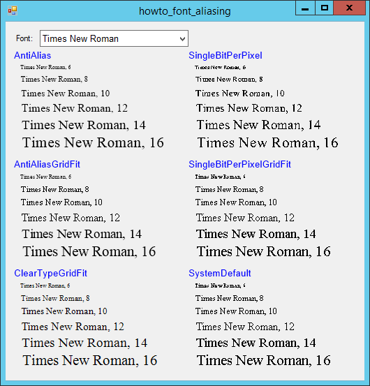
When you use a Graphics object's DrawString method to draw text, you can set the its TextRenderingHint property to tell it what method to use when drawing the text. Often the value AntiAliasGridFit produces a nice result efficiently. For small font sizes, however, the grid fitting techniques mess up the anti-aliasing algorithm and produce a terrible result, as shown in the picture above.
For example, consider the following code.
e.Graphics.TextRenderingHint = TextRenderingHint.AntiAliasGridFit;
using (Font font = new Font("Times New Roman", 12))
{
e.Graphics.DrawString("Test", font, Brushes.Black, 10, 100);
}
This code sets the e.Graphics object's TextRenderingHint property to AntiAliasGridFit. It then creates a font and uses the font to draw some the string "Test" at position (10, 100);
Note in the picture that for very small fonts (in this example 6 point), ClearTypeGridFit seems to give the best result. Of course you probably shouldn't display text that small because it is hard to read in any case.
IMHO, with this font, at least, the best choices for TextRenderingHint are:
- For fonts 14 point or greater, use AntiAliasGridFit.
- For fonts between around 8 and 14 point, use AntiAlias.
- For fonts smaller than 8 point, use ClearTypeGridFit.
These results may not hold for all fonts, so you should experiment with the fonts you are using, but the point is that the same TextRenderingHint values don't produce the same quality result at all font sizes.
Download the example to experiment with it and to see additional details.
|
![[C# Helper]](../banner260x75.png)

![[Beginning Database Design Solutions, Second Edition]](db2_79x100.png)
![[Beginning Database Design Solutions, Second Edition]](db2_79x100.png)